Customize Link interface and behavior using SDK properties
Exercise advanced programmatic control over user interface settings of the Link auth flow
Overview
Most of the configuration for the auth flow is currently managed in Auth flow settings in the Codat Portal.
However, you can use the SDK's options property to override the settings set in the Portal and control them programmatically instead. This is useful if you want more control over the UI based on application-specific logic or want to vary it conditionally.
As the options object overrides the Link settings set in the Portal, this may result in confusion about the source of truth for what users are seeing. Ensure you document and communicate your use of the options prop internally.
<CodatLink
  companyId={companyId}
  onConnection={onConnection}
  onError={onError}
  onClose={onClose}
  onFinish={onFinish}
  options={{
    nonModal: true ...
    showLandingPage: true,
    showSandboxIntegrations: true,
    theme: {...},
    sourceTypes: {
      accounting: {...},
      banking: {...},
      commerce: {...},
    },
    text: {...},
    enableAdditionalConsent: true,
  }}
/>
Properties
The options prop is optional and accepts an object containing the following optional properties:
| Property | Description |
|---|---|
nonModal | Determines whether Link is initialized with non-modal styling (no border and no close button). |
showLandingPage | Determines whether an extra landing page is displayed to the user at the start of Link. |
showSandboxIntegrations | Controls whether integrations that only connect Sandbox data are displayed for selection. |
theme | Contains options that control the visual appearance of the Link flow. |
sourceTypes | Controls the data source types (Accounting, Commerce, Banking, and Business Documents) the user can connect or upload files for. |
text | Contains options that control what text is displayed to the user. Markdown is supported. |
enableAdditionalConsent | Determines whether an additional consent journey for further use cases is displayed to the user. |
The object is applied as the CodatLink component is mounted and doesn't support reloading. Make sure to modify the options before mounting the component.
Grab our example file, edit it as desired, and use it in our Options demo to see how the Link UI reflects the changes you make to the properties. You will need a companyId to do this.
Non-modal styling
By default, the Link component is designed to be presented in a modal. To override this, you can use the nonModal options setting. When set to true, it will:
- Hide the close icon.
- Remove the modal-styled border and padding.
You can see an example of this on GitHub.
Landing page
When showLandingPage property is set to true, an extra page is displayed to the user at the start of the Link flow. When set to false, the user is directed straigt to the navigation page.
Sandbox integrations
The showSandboxIntegrations property controls whether Sanbox integrations are displayed for selection. This should be set to true for test environments and false for live environments.
Theme
Use the colors property of the theme option to set the hex value for the primary color for buttons, links, and loading animations.
Source types
The sourceTypes option controls the source types the user can connect via the Link flow. Use the accounting, banking, commerce, and businessDocuments properties to indicate the desired source type.
For each source type, you can also configure the following properties:
optional: this is a mandatory property. When set totrue, the user can complete the flow without connecting an integration of the specified type or uploading relevant files.enableIntegrations: this is a mandatory property. When set totrue, it enables the user to connect to an integration of the specified type.enableFileUpload: this is a mandatory property. When set totrue, it allows the user to upload relevant documents. You must also enable the relevant file upload integrations in Other integrations.allowedIntegrations: this is an optional property. By default, all configured integrations appear in Link. Add an array of the relevant accounting, banking or commerce platform keys to this property to filter the list of platforms displayed to the user during the authorization journey.
You should only have one of the banking integrations enabled at a time. This ensures optimal use of Link, as each banking integration is represented differently in the auth flow and may confuse the customer.
In your customer's organization, the person signing up through Codat may not have their credentials to hand. For example, it may be their accountant who actually logs into their accounting platform.
To enable them to proceed and explore your product, make upfront authorization for different integration categories optional. Later, remind them to authorize or give them an option to share a Link URL or even a mailto: link.
Custom text
Use the text property to override text displayed within the Link UI. For example, you can detect the language the user speaks and set the displayed text according to their locale. You can see a simple example of this on GitHub.
The property accepts Markdown, meaning you can add links, lists, tables, and more to all the text options, excluding companyName . You can override the following text options:
| Option | Type and description |
|---|---|
companyName | string Your company name displayed on the final page of the flow before connecting an integration. |
landing.title | string (accepts Markdown) Landing page title displayed on the first page the user sees. Enable the landing page by setting showLandingPage to true or configuring it in Link settings. |
landing.subtitle | string (accepts Markdown) Landing page subtitle displayed on the first page the user sees. Enable the landing page by setting showLandingPage to true or configuring it in Link settings. |
main.title | string (accepts Markdown) Title displayed on the page where the user selects what source types to connect. |
main.subtitle | string (accepts Markdown) Subtitle displayed on the page where the user selects what source types to connect. |
accounting.fileUpload.subtitle | string (accepts Markdown) Subtitle displayed on the accounting file upload page. To use this, enable the accounting file upload by setting the source type option to true or by configuring it in Other integrations. |
banking.fileUpload.subtitle | string (accepts Markdown) Subtitle displayed on the banking file upload page. To use this, enable the banking file upload by setting the source type option to true or by configuring it in Other integrations. |
businessDocuments.fileUpload.subtitle | string (accepts Markdown) Subtitle displayed on the business documents file upload page. To use this, enable the business documents file upload by setting the source type option to true or by configuring it in Other integrations. |
accounting.dataAccess.consentbanking.dataAccess.consentcommerce.dataAccess.consent | string (accepts Markdown) Text displayed on the final flow page before connecting an accounting, banking or commerce platform, underneath the list of data types. If you want to display a terms and conditions link, add it here using Markdown. |
accounting.dataAccess.dataTypesbanking.dataAccess.dataTypescommerce.dataAccess.dataTypes | array[string] (accepts Markdown) List of requested data types displayed on the final flow page before connecting an accounting, banking or commerce platform. |
accounting.dataAccess.additionalConsent.titlebanking.dataAccess.additionalConsent.titlecommerce.dataAccess.additionalConsent.title | string (accepts Markdown) Title displayed on the page where the customer consents to the use of their accounting, banking or commerce data for an additional use case. Ensure you set up the source types to support the additional consent flow. |
accounting.dataAccess.additionalConsent.subtitlebanking.dataAccess.additionalConsent.subtitlecommerce.dataAccess.additionalConsent.subtitle | string (accepts Markdown) Subtitle displayed on the page where the customer consents to the use of their accounting, banking or commerce data for an additional use case. Ensure you set up the source types to support the additional consent flow. |
Learn more about array custom text properties
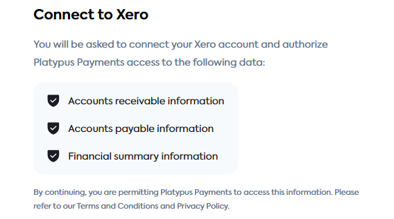
Properties accounting.dataAccess.dataTypes, banking.dataAccess.dataTypes, and commerce.dataAccess.dataTypes are arrays because they control the bullet points displayed on the data access consent page of the Link flow.
Each item of the array is rendered as a separate bullet point and details the data types your customer is agreeing to let you access.
For example, if using Javascript, you can set these values as follows:
// Set when initializing the object
const text : CodatTextOptions = {
  "companyName": "Polly's Profiteroles",
  "accounting.dataAccess.dataTypes": ["Accounts receivable information", "Accounts payable information", "Financial summary information"],
}

// Or set after initializing the object
text["accounting.dataAccess.dataTypes"] = ["Accounts receivable information", "Accounts payable information", "Financial summary information"];
In the Link flow, this will then be rendered as follows:

Additional consent journey
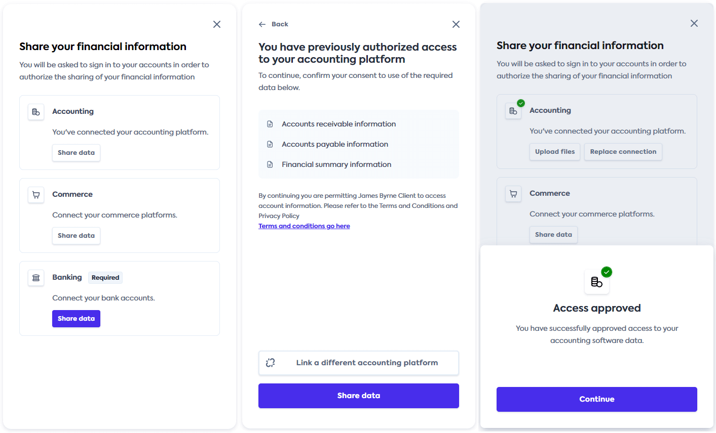
You may need to request additional consent from your customer to use their previously shared financial data for a different purpose. For example, if the customer linked a platform to use your application's cash flow forecasting dashboard, you need additional consent from them if you want to use that data for a lending assessment.
To request additional consent, set the enableAdditionalConsent option to true. This will display an extra consent journey to the customers on their subsequent visits to the Link flow, as shown below.

By default, this option is set to false. Next, use custom text to manage the content displayed to them during this journey.